Challenge
JIO Telecom struggled to maintain a cohesive and engaging brand identity in a competitive market. The design lacked emotional resonance, leading to a fragmented user experience. Its visual identity failed to convey innovation and reliability, making it hard to stand out. Outdated interfaces and inconsistent design across platforms further hindered usability, prompting a need for rebranding to align with user expectations.
Goal
The goal was to craft a cohesive brand identity reflecting JIO's innovation and customer focus. This included a modern, emotionally resonant design unifying all touchpoints. Key objectives were enhancing UI/UX for better usability, boosting engagement, and fostering trust. Success was measured by improved user retention and a distinct, memorable design setting JIO apart from competitors.
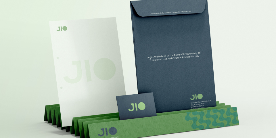
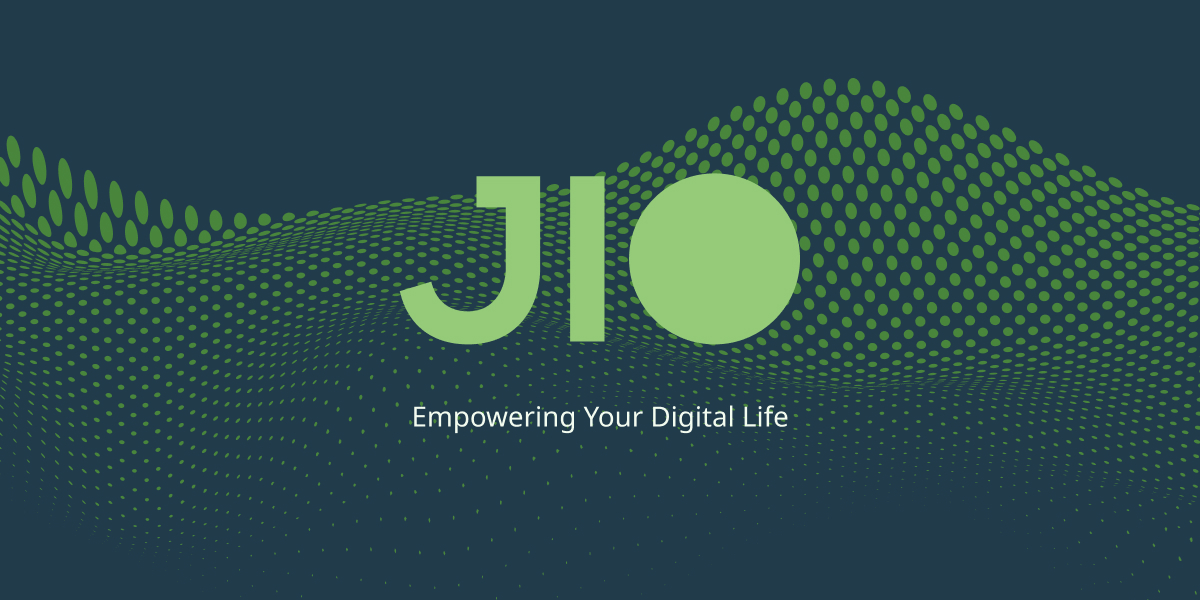
Solution
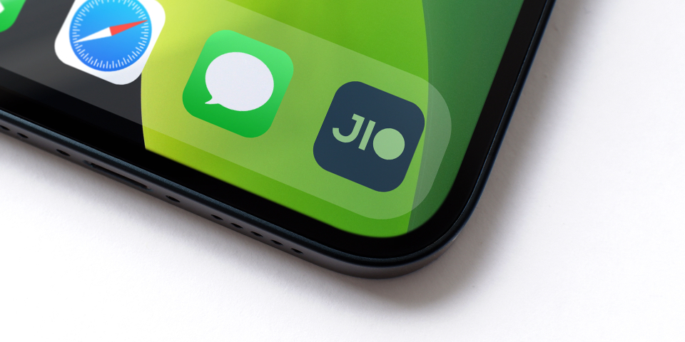
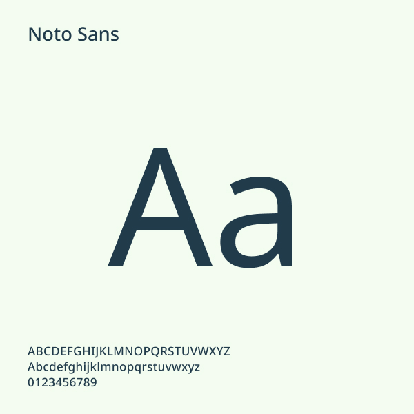
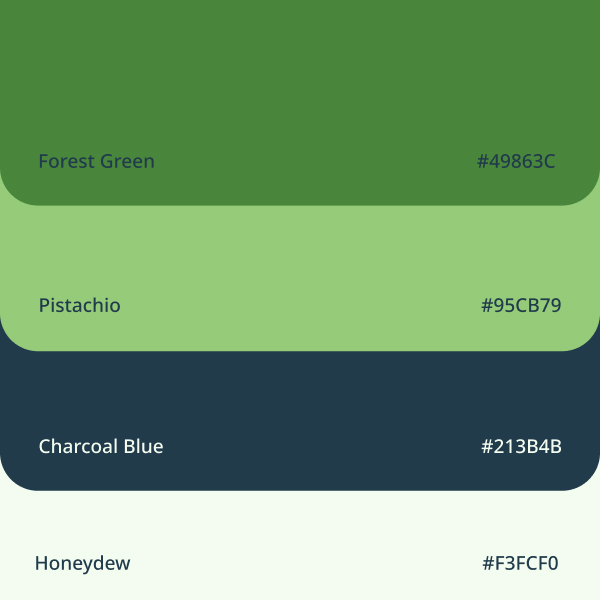
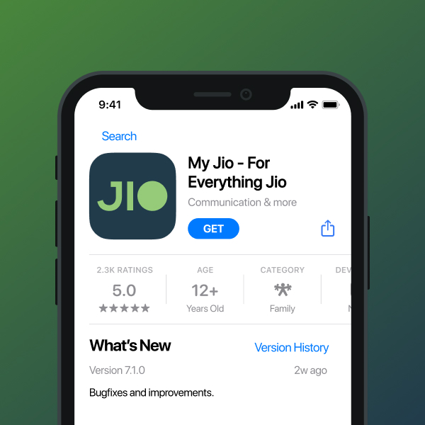
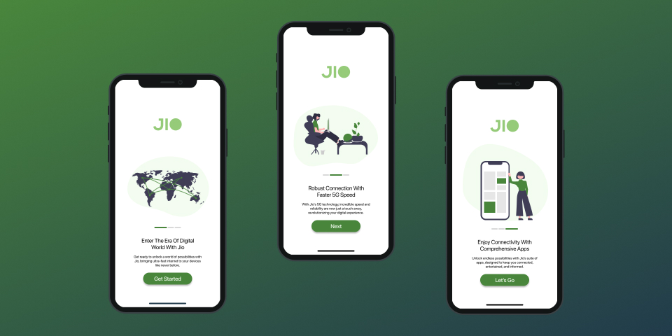
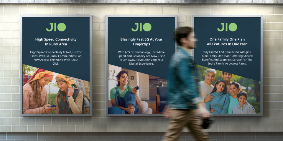
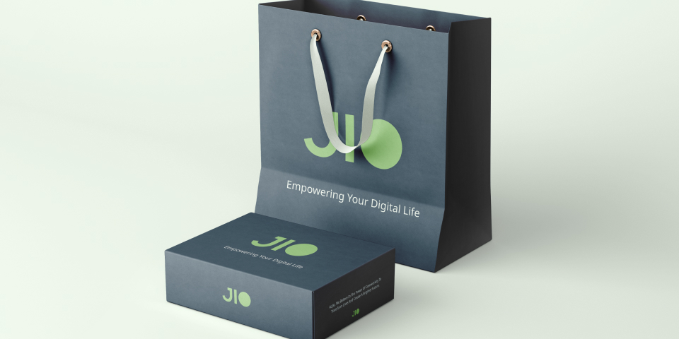
The rebranding began with user research, competitor analysis, and usability testing to uncover key insights. A vibrant design system with bold typography, dynamic gradients, and a tech-inspired palette was created. A refreshed logo symbolized innovation and familiarity. Redesigned platforms focused on intuitive navigation, accessibility, and responsiveness, delivering a cohesive identity and enhancing trust and engagement.