Challenge
Plex+ faced the challenge of revitalizing its design to cater to a growing user base while maintaining core functionality. The existing platform had a cluttered interface, inconsistent elements, and lacked advanced features, making it hard to meet evolving expectations. The challenge was to overhaul the design to create a user-centric, visually appealing, and functional platform for future needs.
Goal
The goal was to introduce a refined design system that enhanced user experience while maintaining simplicity. This involved creating a cohesive visual identity, improving navigation, and adding advanced features. Another objective was to streamline the design process for better collaboration between teams. Success was measured by increased user engagement, better feedback, and improved brand perception.
Solution
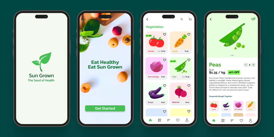
The project began with user feedback analysis, competitor research, and stakeholder interviews to identify areas for improvement. A modern design system was created with consistent typography, color schemes, and UI components. Simplified navigation enhanced usability, and interactive prototypes tested new features. The modular design allowed scalability, and cross-functional collaboration ensured alignment. The redesigned Plex+ platform improved usability and set a new standard for innovation, resulting in higher user satisfaction and engagement.